

"Don't judge a book by it's cover"
We've all heard the saying. The one that tells us to read the summary or the first chapter before making judgement. Of course, most of us know the validity (or lack of) of this statement, why else would publishers, marketers and authors put so much time and effort into making stunning covers.
There are several aspects that I find absolutely gorgeous when implemented correctly into a cover.
1. Cool Fonts
Anything but Times New Roman is usually beautiful. It's even better when the font of the title matches the story in the book. Fantasy corresponds to swirly, wavy letters while contemporary corresponds to straight, slim letters.
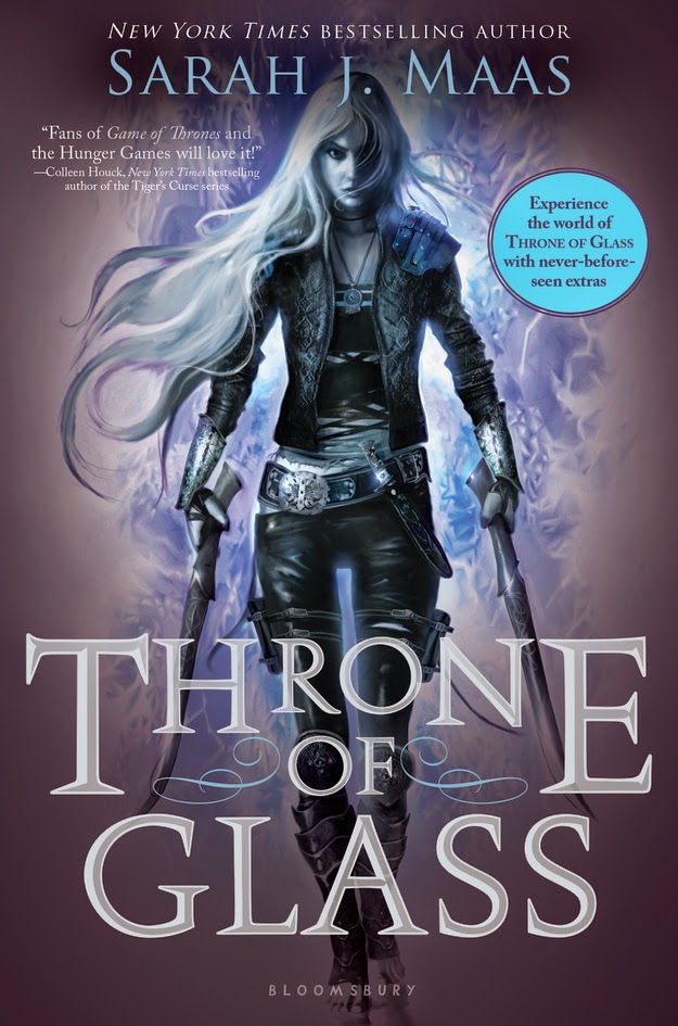
Some examples include:


2. Abstract drawings
It's hard to describe this, but a really good example is of the Shatter Me Trilogy. Anything that doesn't make use of real objects/people but puts an interesting twist to them.

I just love this entire eye scheme the trilogy has. Each cover has a different season within the theme, which is exemplified in the eyelashes. Generally I think eyes are just beautiful and the twist put on this in this cover is amazing. Props to the artist.
While this cover showcases a person, it's more of a drawing and honestly it's just so incredible and beautiful. All of the covers are.
3. A central focus
There are several covers that have people and things all over the place (*cough* Blood of Olympus *cough*) and are too complicated and messy to be aesthetically pleasing.

There's no one color scheme or one character, it's just everything...which is too much.
There are just a few of the things I like in book covers. What makes a book aesthically pleasing to you? Let me know in the comments below!
No comments:
Post a Comment